 i
Letterform Archive · Dogpatch
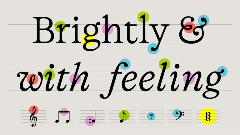
Type for All! Ten Years of Type West
Main Gallery show marking ten years of the Archive's Type West program: 260+ pieces of student work, from sketches and proofs to finished typefaces from 31 countries.
Ryan Molloy drew his typeface Banch without a single right angle, so a router could cut its counters out of wood. Nearby are letters cut into stone with a hammer and chisel at a weekend workshop in the program's first term.
The show marks ten years of Type West, the Archive's year-long type design certificate, with over 260 pieces from every cohort since 2016. You walk in past a wall listing every graduate, each name set in the typeface they made. Beyond it, sketches, proofs and instructor markups hang beside finished specimen posters, and in ten places a student font sits next to the collection item behind it, such as a 1964 wood type specimen beside Seth Hamlin's Morgan.
Come to see how a font gets from pencil sketch to working family, in scripts from Latin and Arabic to Indic and Kanji. It's in the Main Gallery on Floor 4R: $10, free on Thursdays until 8pm, and the 64-page companion book is free in the gallery.
Look for
Banch by Ryan Molloy
Look for a typeface drawn with no right angles, so that its counters could be cut out of wood with a router.
The stone-cut letters
Look for letters carved into stone with hammer and chisel at a weekend workshop in Type West's first term.
The name wall
Look for the running list of every certificate graduate and their typeface, each name set in that typeface, on the wall that greets you as you enter.
Morgan beside its wood type source
Look for Seth Hamlin's Morgan paired with a page of Rob Roy Kelly's 1964 American Wood Type specimen, one of ten such student and collection pairings.
Undertone by Joshua Michael Diaz
Look for a multiweight, bell-bottomed script that draws on the groovy look of the 1960s and '70s.
Good for
- Cheap Culture
- Evening Visits
- Locals Who've Seen It All
- Nerding Out
Skip if
You want finished art rather than student work: these are type design students' sketches, proofs and fonts.
With kids
Children 12 and under get in free.
Also at Letterform Archive
On now nearby
Nearby
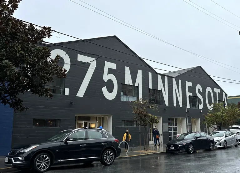
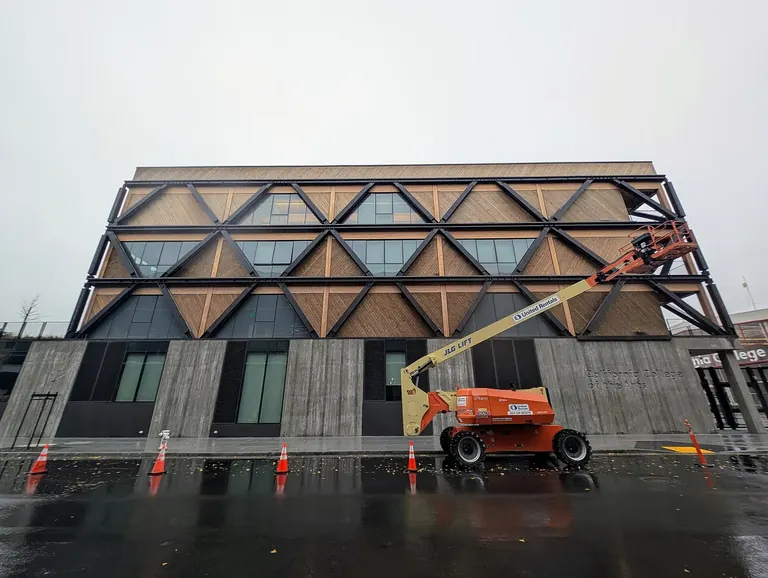
Image credits
7
- Type for All! Ten Years of Type WestLetterform Archive
- Unfinished LinesCourtesy of Minnesota Street Project
- Flora + FaunaCourtesy of Minnesota Street Project
- Felicia Chiao: Not Too SweetCourtesy of Minnesota Street Project
- Letterform ArchiveClyde Charles Brown / Wikimedia Commons, CC BY-SA 4.0
- Minnesota Street ProjectPigeonChickenFish / Wikimedia Commons, CC BY-SA 4.0
- CCA Wattis Institute for Contemporary ArtsMariwlqs / Wikimedia Commons, CC BY-SA 4.0