Setting Up QR Code Audio Guides: A Practical Guide
Frequently Asked Questions
What size should a QR code be for a museum audio guide?
Minimum 2cm x 2cm for close-range scanning (someone holding their phone near a sign). For distance scanning (entrance banners, wall-mounted signs), scale up proportionally. A code meant to be scanned from two metres away should be at least 10cm x 10cm. Test with real phones in real lighting before printing.
Should museums put a QR code next to every artwork?
No. A QR code at every stop is clunky and breaks the visitor's flow. A better model is one QR code at the entrance that launches the entire tour. Visitors who want a specific exhibit can type its name into the guide. One scan, then the phone handles the rest.
What URL should a museum QR code point to?
Use a stable URL you control (like your own domain with a redirect) rather than a vendor-specific URL. If you switch providers or update the guide, you change the redirect without reprinting anything. A short, readable URL like yourmuseum.org/guide also works as a typed fallback.
How do you test QR codes before printing them for a museum?
Test on at least five different phones, mix of iPhone and Android, old and new. Test in the actual lighting conditions where the code will be displayed. Test at the distance visitors will realistically scan from. Test at an angle, not just head-on. If any phone struggles, the code needs to be larger or the contrast needs to be higher.
A QR code is a rectangle. Getting it right shouldn't be complicated. And yet, museums routinely print codes that don't scan, stick them where nobody looks, and point them at URLs that break six months later.
The technical part of QR codes is simple. The operational part (where you put them, what they link to, how visitors actually experience the moment of scanning) is where things go wrong.
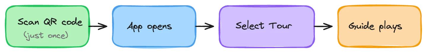
One code, not fifty
The instinct many museums have is to put a QR code next to every artwork. Each code links to information about that specific piece. It sounds logical.
In practice, it's terrible.
A visitor walks up to a painting. They pull out their phone. They open the camera. They scan the code. They wait for the page to load. They listen or read. They finish. They walk to the next painting. They pull out their phone again. Open the camera again. Scan again. Wait again.
By the third painting, most people stop. The friction of scan-listen-pocket-repeat kills the flow of actually looking at art. The guide becomes an interruption rather than a companion.
The better model is a single QR code at the entrance. One scan launches the entire tour. From there, the visitor's phone handles everything: navigation between stops, audio playback, the full experience. No more scanning. The guide lives on their phone for the rest of the visit.
What if someone wants to jump to a specific exhibit? They type the name. Most modern web-based guides support search. Typing "Starry Night" into a text field is faster than hunting for a 2cm square on a wall label you can barely read. It also works from across the room, which a QR code does not.
One scan at the start. Then the phone does the work. This is the model that actually keeps visitors engaged.
Where to put the QR code
If visitors don't see the code, it doesn't exist. This sounds obvious, and yet the most common placement we encounter is a small printout on the information desk, below counter height, behind a stack of brochures, visible only if you're already leaning over the desk and looking for it.
The entrance is the primary location. A banner, a standing sign, a wall-mounted display. Something a visitor sees within their first ten seconds in the building. The window between "I just walked in" and "I'm already looking at the first exhibit" is short. Your QR code needs to live in that window.
The ticket desk is the second location. When a visitor is standing at the counter, they have a moment of dead time. A sign on the counter with the QR code and a single sentence ("Free audio guide: scan to start") catches them at the one point where they're stationary, phone probably already in hand to check tickets or show confirmation emails.
Your website is the third. If the guide is web-based, there's no reason visitors can't start it before they arrive. A link on your visit planning page, not buried in a FAQ but visible on the page itself, lets people access the guide on their own terms.
Brochures and printed materials. If you produce a visitor map or a what's-on flyer, put the QR code on it. A code on the back of the map gets scanned right when someone pulls it out to figure out where they are, which is exactly when they might also want the audio guide.
Google Maps and other listings. Your Google Business Profile lets you add links. Visitors who find you on Google Maps are in planning mode. A direct link to the audio guide there means some visitors arrive with the guide already loaded. Also consider ticket confirmation emails, social media posts, and anywhere else you communicate with visitors before they walk in.
The principle: put the QR code everywhere a visitor has a natural pause and a reason to look down at something.
Sizing and scannability
A QR code that's too small to scan is worse than no code at all. The visitor tries, it fails, and now they've associated your audio guide with frustration before they've even started.
Minimum 2cm x 2cm for close-range scanning: a counter sign, a brochure, a small printed card. This works when someone is holding their phone 15-20cm away, steady, in decent light.
For distance scanning, scale up. A banner that visitors scan from a metre away needs at least 6-8cm. From two metres (the kind of entrance display you want people to notice as they walk in), 10cm or larger. The rule of thumb: the scanning distance divided by ten gives you the minimum QR code dimension. Two-metre distance, 20cm code.
Contrast matters more than colour. A QR code needs strong contrast between the modules (the dark squares) and the background. Black on white is the safest choice. Dark blue on white works. Light grey on cream doesn't. If you're printing on a coloured background, test before committing to a print run.
Don't compress the quiet zone. The white border around a QR code isn't decorative, it's functional. Scanners need that margin to identify where the code starts and ends. Crop it too tight and the code becomes unreliable. At least four modules of white space on every side.
Branding without breaking things
QR codes can include logos. They can be styled with colours. They can be made to look more polished than a standard black-and-white grid. But every design choice you make trades off against reliability.
QR codes have built-in error correction, so they can still be read with a portion of the data obscured. This is what makes centre logos possible. The code works if 15-25% of its area is covered, depending on the error correction level. Push beyond that and you're gambling.
A few rules:
Use high error correction (level H, 30% recovery) if you're adding a logo or any visual modification
Keep the three corner squares untouched. Those position markers are how scanners orient the code. Altering them makes the code fragile
Test the styled version on five different phones before approving it. What scans fine on a new iPhone may fail on a three-year-old Android in dim lighting
When in doubt, keep it simple. A clean black-and-white QR code that every phone reads instantly is better than a branded one that fails 10% of the time
The branded code is a nice-to-have. Reliable scanning is a must-have.
URL strategy: plan for change
This is the mistake that costs the most money, because you only discover it after you've printed 10,000 brochures.
If your QR code points directly to a vendor URL like app.vendorname.com/museum/your-tour-id, you've hard-coded a third-party dependency into a physical object. Switch vendors? Dead link. Vendor changes their URL structure? Dead link. All those printed signs, brochures, and banners now point to nothing.
Use your own domain. Set up a redirect like yourmuseum.org/guide that points to wherever the current audio guide lives. If you change vendors, change platforms, or update the URL, you update one redirect. Every printed code still works.
This costs almost nothing to set up. Your web team adds a redirect rule. Five minutes of work that saves you from reprinting materials every time something changes on the technology side.
Make the URL readable. Print the URL in plain text alongside the QR code. yourmuseum.org/guide, something a human can type into a browser. Not everyone scans QR codes. Some visitors don't trust them. Some have older phones. Some just prefer typing. A short, clean URL gives them an alternative that takes ten seconds.
Both the QR code and the text URL should reach the same destination. One link, two ways to get there.
Testing before you print
QR codes fail silently. They look fine to the human eye. You assume they work because they look like they should work. Then a visitor tries to scan one in the dim lighting of your medieval gallery and nothing happens.
Testing needs to cover the actual conditions where the code will be used. Not your well-lit office. Not a brand-new phone.
Phone variety. Test on at least five devices. Include an older Android phone, the kind a tourist might be carrying, not the latest flagship. Include an iPhone that's a generation or two behind. If your visitors skew toward budget phones, test on budget phones.
Lighting. Test in the actual space where the code will be displayed. Museum lighting is often low. Gallery lighting creates glare on glossy surfaces. A QR code on a laminated sign under a spotlight might be unscannable from certain angles. Test from the angles visitors will actually approach from, not just straight on.
Distance. Stand where a visitor would stand and try to scan. If the code is on a wall sign at arm's length, that's your test distance. If it's on a banner across the lobby, scan from across the lobby.
The full journey. Don't just test whether the code scans. Test the entire flow. Does the page load quickly on mobile data? Is the landing page clear? Can they start the tour within ten seconds of scanning?
Every step between "visitor points phone at code" and "audio starts playing" is a place where you can lose them.
The full visitor journey
Zoom out from the QR code itself and think about the complete chain of events. A visitor walks in, sees a sign, scans the code. Their phone's browser opens. A page loads. They see... what? How many taps between landing on that page and hearing the first stop of the tour?
The best version: scan, page loads, tour starts. The visitor is listening before they've finished putting their phone in their pocket.
The worst version: scan, app store opens, download prompt, account creation form, email verification, terms of service, tutorial screens, language selection, loading spinner. The visitor closed the browser after step two.
If your audio guide is web-based, you skip the app download entirely. The QR code opens a web page, and the audio guide runs in the browser. No installation, no account, no waiting. The gap between "I scanned the code" and "I'm on the tour" can be under five seconds.
Test this end-to-end with someone who has never seen the guide before. Hand them a phone, point them at the QR code, and watch. Don't help. Don't explain. If they hesitate at any point, that's a friction point to fix.
Staff should be able to demo it in five seconds
A visitor at the front desk asks about the audio guide. Your staff member should be able to pull out their own phone, scan the code, and show the visitor a working tour in the time it takes to answer the question. Five seconds.
This isn't about deep product training. It's about familiarity. Staff who've scanned the code themselves, who know what the visitor will see, who can say "it looks like this, just scan that sign" while showing their own screen — those staff members convert visitors at a much higher rate than someone who says "there's information about the audio guide on our website."
Keep a printed QR code at the desk. Make sure every front-of-house staff member has scanned it at least once. That's the minimum. We've written more about staff training in a separate article, but the QR code demo is the one non-negotiable.
Common mistakes
QR codes on glossy surfaces under direct light. The glare makes them unscannable from most angles. Use matte finishes for any printed code that will be displayed under gallery lighting.
Codes placed after the point of decision. A QR code in gallery three doesn't help a visitor who decided not to use the guide when they walked in ten minutes ago. The code needs to be at the decision point: the entrance, the first moment.
Testing only on new phones. Your visitors don't all have the latest hardware. A code that works on an iPhone 16 but fails on an iPhone 11 will fail for a meaningful percentage of your audience. Test old devices.
Forgetting to update the redirect. You set up yourmuseum.org/guide and it works great. Six months later, you change audio guide platforms. Nobody updates the redirect. For weeks, visitors scan a code that leads to a dead page. Put a calendar reminder to verify the redirect every quarter.
The simplest possible version
If everything in this article feels like a lot, here's the minimum viable QR code setup:
Generate a QR code pointing to a URL you control (a redirect on your domain)
Print it at least 6cm x 6cm on a matte-finish sign
Put the sign at your entrance where visitors can see it within five seconds of walking in
Print the URL in readable text below the code
Test it on three phones in the actual lighting conditions
Make sure your front desk staff have scanned it once
That's it. Six steps. You can do this in an afternoon. Everything else in this article is optimization — worth doing, but not required to get started.
If you're setting up QR codes for an audio guide and want a second opinion on placement, sizing, or URL strategy, we can take a look.