Audio Guide Adoption Rates: How to Get Visitors to Actually Use Them
Frequently Asked Questions
What is a realistic audio guide adoption rate for museums?
Published industry data points to a low baseline: a 2025 Nubart study of 175 museum audio guide apps found an average download-based adoption of 2.47%, and the British Museum's audio guide sits at roughly 3% of visitors. With low-friction web-based access and active promotion, our internal benchmarks at Museo Miraflores plan for 20-40%. Claims of 85%+ adoption are unrealistic unless the entire visit is designed around the audio guide.
How do you increase audio guide usage at a museum?
Treat it as a funnel: visitors need to know the guide exists, access it without friction, get through setup quickly, and find the content worth continuing. Weak points at any stage cause dropoff. The biggest gains usually come from reducing access friction and training front desk staff to mention the guide.
Do free audio guides get more users than paid ones?
Free guides get more initial users, but paid users tend to engage more deeply and use the guide for longer. Revenue share or paid models attract visitors who are already committed. The right choice depends on whether you're optimizing for reach or per-user engagement.
Why do visitors stop using audio guides partway through?
Common reasons include content that doesn't match their interest level, stops that run too long, poor audio quality, and guides that can't adapt to their pace. Traditional audio guides are especially prone to this because every visitor hears the same recording regardless of what they care about.
Here's a number most audio guide vendors won't tell you: the typical museum gets somewhere between 2% and 20-40% of visitors to actually use their guide. Not 85%. Not "most visitors." Single digits to maybe a third, depending on how well you set things up.
The 85% figure that floats around sales decks and conference talks is fantasy for any institution running an audio guide as an optional add-on. It only holds when the entire experience is designed around the audio — immersive exhibitions where the audio is the experience. For everyone else, the question isn't how to hit 85%. It's how to move from 4% to 15%. Or from 15% to 30%.
The difference between those numbers is real money and a meaningfully different visitor experience. So it's worth understanding where the dropoff actually happens.
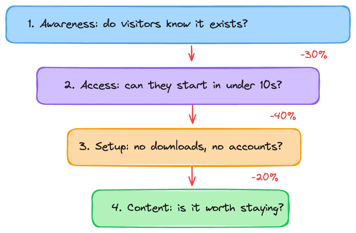
Adoption is a funnel, not a switch
Museums tend to think about audio guide adoption as a single metric: what percentage of visitors used it? That's the wrong framing. Adoption is a funnel with distinct stages, and visitors leak out at every one.
Awareness. Does the visitor even know the guide exists? This sounds obvious, but we've seen museums with excellent audio guides that visitors simply never hear about. No signage at the entrance. Nothing on the website. The front desk doesn't mention it. A guide nobody knows about has a 0% adoption rate no matter how good it is.
Access. The visitor knows about it. Now what? Do they need to download an app? Create an account? Pay at the desk? Borrow a device? Each step is a decision point, and every decision point loses people. A visitor standing in a lobby with their family isn't going to spend four minutes setting up an app. They'll just walk in without it.
Process. They've started accessing the guide. Is the setup smooth? Does the app load quickly? Can they figure out how to start a tour without instructions? Does the QR code actually work? This stage is brutally unforgiving. Ten seconds of confusion and people give up. They came to see art, not troubleshoot software.
Content quality. They're in. They're listening. Is it good enough to keep going? This is where traditional audio guides bleed users. The content is a fixed monologue that doesn't match every visitor's pace, interest, or knowledge level. Someone gets bored at stop three and takes the earbuds out. That counts as adoption in many tracking systems, but it's not a real user.
Each stage has its own failure modes and its own fixes. Improving content quality won't help if nobody knows the guide exists. Reducing access friction won't matter if the content drives people away after two minutes.
The awareness gap is bigger than you think
Start from the visitor's first contact with your institution. That's usually the website.
Most museum websites treat audio guides as an afterthought, buried in a "plan your visit" dropdown, maybe mentioned in a FAQ. By the time a visitor arrives at your front door, they've already made a mental plan for their visit. If the audio guide wasn't part of that plan, you're fighting an uphill battle at the entrance.
The fix is simple and free. Put the audio guide on your website where people actually look. Not a small text link in the footer. A visible element on the main page or the visit planning page that says what the guide is and how to get it. If it's a web-based guide, visitors can even start it before they arrive.
Physical signage matters too. Banners near the entrance with a QR code. Not a small A4 printout taped to the desk, but a proper sign that a visitor can see from ten feet away. The lower the cognitive load of "oh, there's an audio guide, let me try it," the more people will try it.
Then there's staff. This one is underrated. The person at the front desk or ticket counter has thirty seconds of conversation with almost every visitor. If they mention the audio guide, even a single sentence, adoption rates go up meaningfully. "We have a free audio guide, just scan that QR code" takes five seconds. But it only works if front desk staff know the guide exists, know how it works, and have actually tried it themselves.
In our own deployments — most directly at Museo Miraflores in Guatemala City — training reception staff to mention the guide during the ticket interaction has been the single biggest lever for moving adoption upward. No new technology. No redesigned signage. Just a sentence. The same pattern shows up in the Mannion et al. research above: "time" and "confidence" are the two attributes that most often stop visitors from picking up a guide, and a five-second front-desk mention addresses both directly.
Access: optimize for your model
How visitors access the guide is tightly linked to your business model, and there's no single right answer. But the tradeoffs are clear.
Free, web-based access gives you maximum reach. No app download, no account creation, no payment screen. Visitor scans a QR code and they're in. This is the lowest-friction option and will get you the highest raw adoption numbers. If your goal is "as many visitors as possible should experience the guide," this is the path.
Paid access reduces the number of users but changes the composition of your audience. Someone who pays for a guide, even a few euros, has made a conscious decision. They're more invested. They use the guide longer. They listen to more stops. They're less likely to try it for thirty seconds and bail. If your guide is a revenue line, paid access with a well-set price point can produce better financial outcomes than free access with higher adoption.
Revenue share models sit in between. The visitor pays, but the museum's cost is proportional to actual usage rather than a fixed licensing fee. This aligns incentives: the guide provider is motivated to help you increase adoption because their revenue depends on it.
The choice depends on what you're solving for. A small museum trying to improve the visitor experience might want free access to maximize reach. A large institution with a strong brand can charge because visitors expect and budget for it. The worst option is paid access with high friction: charging and making it hard to get to. That gives you the downsides of both models.
Whatever your model, audit the actual access flow. Time yourself going from "I want to use the guide" to "I'm hearing the first stop." Every additional screen, form field, or loading spinner is a moment where someone decides this isn't worth the hassle — and the gap between an app-based guide (download, install, account, launch) and a web-based one (scan, listen) is one of the clearest predictors of adoption in the published research above.
The content dropoff problem
Getting visitors to start the guide is only half the challenge. Keeping them is the other half — and traditional audio guides are bad at it.
The typical pattern: a visitor starts the guide, listens to the first two or three stops, and then gradually stops pressing play. By stop six or seven, they've pocketed the device or closed the app. The guide wasn't bad, exactly. It just wasn't good enough to compete with the museum itself for their attention.
This happens because traditional guides are inflexible. A 90-second recording about a Renaissance painting delivers the same information to a ten-year-old, a retired art teacher, and a tourist who doesn't speak the language well. It can't speed up for someone who already knows the context. It can't slow down for someone who's confused. It can't skip the provenance details for a visitor who just wants to know what the painting depicts.
The result is a one-size-fits-none experience. Some visitors find it too shallow. Others find it too dense. Many find it too slow — they've already moved to the next piece while the recording is still talking about brushwork.
AI-generated guides change this equation because they respond to the visitor. Someone who asks questions gets deeper answers. Someone who moves quickly gets shorter introductions. A visitor in a group with children gets a different register than a solo visitor spending an afternoon. The content adapts, which means the gap between "what the visitor wants" and "what the guide delivers" stays small enough that they keep listening.
We've tracked this in our own data. Across the Museo Miraflores deployment (Musa internal data, 2026), visitors using the AI-powered guide engage with noticeably more stops per session than the patterns reported for fixed-recording guides in the Mannion et al. study above, where the dominant behaviour was "code hunting" — wandering between icons rather than working through the tour. The reason isn't that AI content is inherently better word-for-word. It's that it stays relevant to each person, so fewer people bail.
Paid users behave differently
One counterintuitive pattern: visitors who pay for the audio guide use it more thoroughly than visitors who get it free.
This makes sense if you think about it. Paying is a commitment. Even a small amount (three euros, five dollars) creates a psychological stake. "I paid for this, so I'm going to use it." Free guides don't create that commitment, which is why free access produces higher initial adoption but often lower per-user engagement.
The practical implication is that raw adoption rate can be misleading. A museum with 30% adoption at a free tier and 10% adoption at a paid tier might actually have more total guide-minutes consumed in the paid model, because each paid user engages for much longer. It depends on your numbers, but the relationship isn't linear.
If you charge, the guide needs to justify its price immediately. The first 60 seconds of content matter enormously. They're the difference between "this was worth it" and "I wasted five euros." That's another area where AI guides have an advantage: they can make that first interaction feel personal and responsive, which reinforces the purchase decision.
All three parts have to work together
Access, process, and content quality aren't independent. They interact. A museum that reduces friction to zero but has mediocre content will get high trial rates and terrible retention. A museum with world-class content behind a clunky four-step setup process will never get enough users to the content for it to matter.
The most common failure mode we see is museums investing in one area and neglecting the others. They redesign the signage but don't fix the app onboarding flow. They upgrade to an AI-powered guide but don't tell front desk staff about the change. They make access free but don't update the website to reflect it.
Think of it as a chain. The weakest link sets the ceiling on your overall adoption. If your content is great but your access flow takes three minutes, you'll cap out at whatever percentage of visitors are patient enough to endure three minutes of setup. If access is frictionless but content is generic, you'll cap out at whatever percentage of visitors don't mind a mediocre guide.
Audit each stage independently. Walk through your own front door as if you've never visited. Can you find the audio guide? Can you start it in under a minute? Does the first stop make you want to hear the second? Get honest answers to all three, and you'll know where your adoption ceiling is.
Setting realistic targets
Given everything above, what should you actually aim for?
It depends on your setup. The lowest tier below maps directly onto the published Nubart and Museums and the Web figures cited earlier; the higher tiers are working benchmarks from our own deployment at Museo Miraflores (Musa internal data, 2026) and should be read as the ranges we'd plan against, not as published industry averages:
No active promotion, app-based, paid: roughly 2-5% adoption. This is consistent with the Nubart 2025 average of 2.47% and with the British Museum's reported ~3% take-up. It's the default when museums buy a guide and don't think much about distribution.
Basic promotion, app-based, free: higher than the baseline but the app download stays a barrier — Nubart's 2.47% average covers both free and paid apps in the sample, and in our experience the install step alone is enough to keep adoption in single digits at most institutions.
Active promotion, web-based, free: removes the download and adds signage and staff mentions; the top-performing app in the Nubart sample (Museum Barberini at ~20%) was already an outlier among app-based guides, and in our experience removing the install step is the single biggest unlock for moving adoption out of single-digit territory. Clearing Barberini's ceiling reliably tends to require the stronger-content tier below.
Active promotion, web-based, free, strong content: in our Museo Miraflores deployment we plan against 20-40% as a realistic target when all funnel stages are tuned.
Getting above 40% generally requires the audio guide to be part of the core experience, either because the exhibition is designed around it or because the institution has a culture of guide usage that visitors already expect (common at major sites with strong tourism traffic).
The point isn't to hit a specific number. It's to know where you are, identify which stage of the funnel is leaking the most, and fix that stage before worrying about the others. Going from 4% to 12% is often easier, and more impactful, than going from 25% to 35%.
Where AI makes the biggest difference
AI-powered guides don't magically fix adoption. You still need signage, staff training, and a sensible access flow. But they shift the math on the content quality stage, which is the hardest one to fix with traditional approaches.
A traditional guide that loses visitors at stop three is stuck. The recording is what it is. You'd have to re-script, re-record, and re-distribute to improve it. With an AI guide, you adjust the persona's instructions, tweak the per-stop prompts, or add more source material. Changes propagate immediately. You can iterate weekly instead of yearly.
The friction reduction matters too. A web-based AI audio guide means no app download, no device rental line, no hardware to return. The visitor's phone becomes the guide. Scan a QR code, start listening. That alone can move you up one or two tiers in the benchmarks above.
If you're trying to improve your adoption rate, or thinking about what kind of guide to invest in next, let's talk through the specifics of your situation. The right answer depends on your institution, your visitors, and what you're optimizing for.