More Accessible Tours with Visual Awareness
Musa now automatically generates detailed visual descriptions of every image uploaded to Studio. The guide can talk about what it sees, not just what it knows.
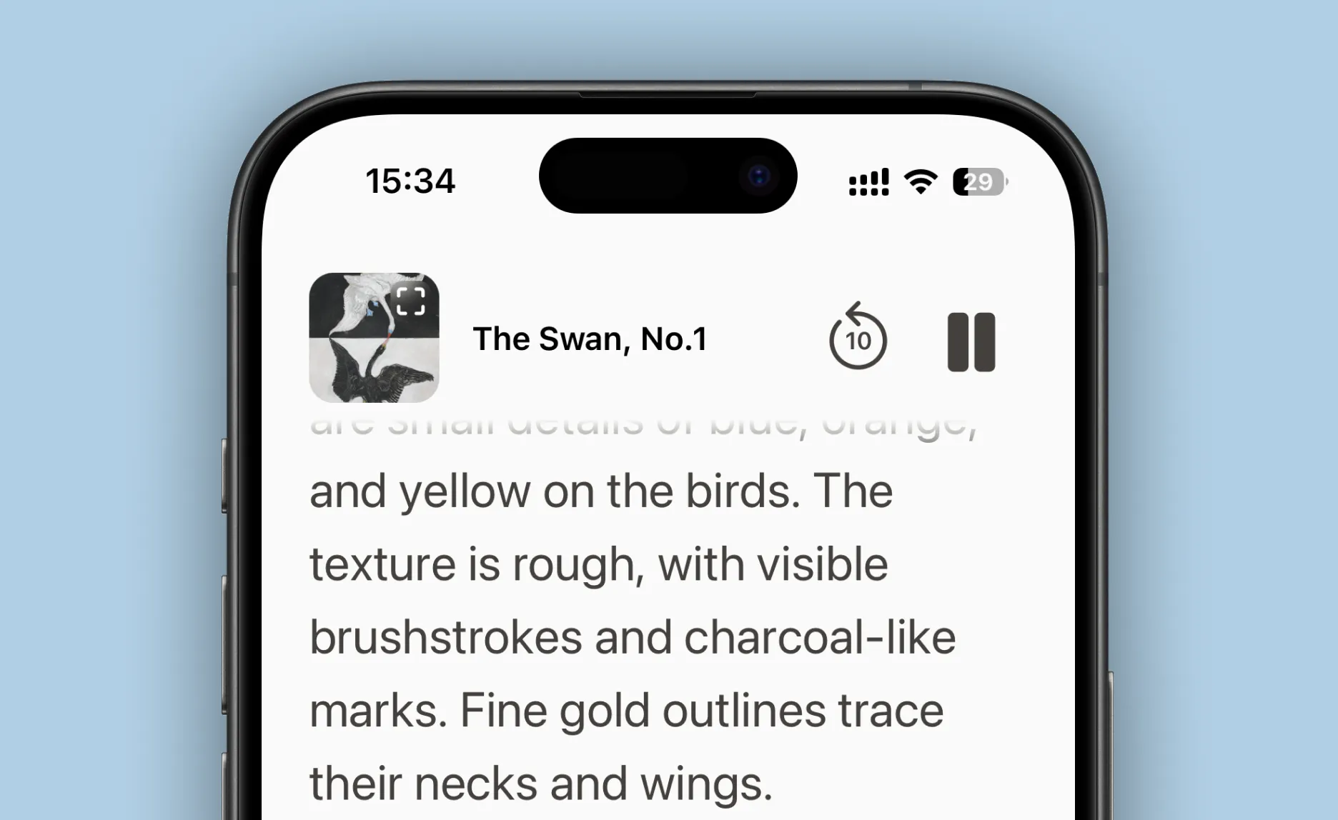
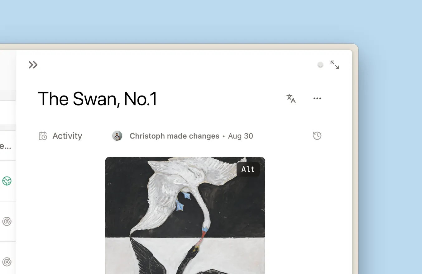
The texture is rough, with visible brushstrokes and charcoal-like marks. Fine gold outlines trace their necks and wings.
Why this matters for accessibility
Traditional audio guides tell you about the artist's life, the historical context, the movement. But they rarely describe what you're actually looking at. With image descriptions, our guides can.
It helps everyone
When we added image descriptions, something shifted—not just for accessibility scenarios, but across the board. Visitors asked more specific questions. The guide gave more grounded answers.
We looked into why. Turns out there's a name for it: the curb cut effect. Features designed for specific needs often end up helping everyone. Curb cuts were built for wheelchair users, then parents with strollers started using them, then delivery workers, travelers, cyclists.
Something similar happened here. When the guide can see the image, the conversation is about this artwork—not art in general. Instead of talking about "Hilma af Klint's geometric compositions" in the abstract, it can point to this specific yellow triangle, that particular brushstroke. It notices the gold outlines, the charcoal texture, the way two swans reach toward each other.
A few things that work better now:
Visitors can point at things. When someone asks "what's that gold part?", the guide knows what they mean. It can explain that those fine gold outlines trace the swans' necks and wings — a signature af Klint technique.
Descriptions feel specific. Instead of generic language, the guide can describe what it's actually like to stand in front of the work: the roughness of the texture, the contrast between black and white swans, the unexpected blue and orange.
The guide can direct attention. "Notice how their beaks meet in the middle" or "look at the charcoal-like marks in the background" — the kind of guidance you'd get from someone who's looking at the same thing you are.
How it works
When you upload an image to Studio, we generate a detailed description: composition, colors, textures, the relationships between elements. This becomes part of what the guide knows—invisible to you and your visitors, but there when it matters.
We're still learning how visitors use this. If you notice anything interesting, we'd love to hear about it.