In most jurisdictions, yes. The ADA, the European Accessibility Act, and similar legislation require cultural institutions to provide accessible experiences. But legal compliance is the floor — accessible audio guides also serve a much larger audience than you'd expect, including older visitors and anyone in a noisy environment.
Can screen readers work with audio guide apps?
They can, but only if the app is built for it. Every interactive element needs proper labels, focus order must be logical, and the app can't rely on visual-only cues. Most audio guide platforms weren't designed with this in mind. Testing with actual screen reader users — not just automated checks — is the only way to know if it really works.
How do audio guides accommodate deaf or hard-of-hearing visitors?
Through real-time transcripts with synchronized highlighting, adjustable playback speed, and integration with device-level hearing accessibility features like hearing aid streaming and mono audio. The transcript should be a first-class feature, not an afterthought.
What is the curb cut effect in museum accessibility?
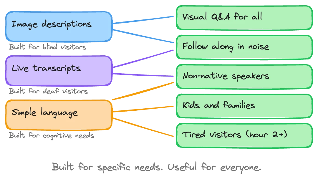
The curb cut effect describes how features designed for disabled people end up helping everyone. Curb cuts were built for wheelchair users but are used by parents with strollers, travelers with luggage, and cyclists. In audio guides, the same pattern holds: image descriptions built for blind visitors improve the guide's ability to answer visual questions from any visitor.
Most museum audio guides fail basic accessibility. Not out of malice — out of oversight. The app loads, the narration plays, and it works fine for most visitors. But hand the same guide to someone using a screen reader and it falls apart. A visitor with low vision can't resize the text. A deaf visitor gets no transcript. A visitor with limited hand mobility struggles with small tap targets.
Museums know this is a problem. When we talk to partners about Musa, accessibility comes up in nearly every conversation. The response, honestly, is "yes and no." Yes, we support screen readers, high contrast, and device-level font sizing. No, the industry as a whole hasn't caught up. Some museum teams get excited when they hear what's possible. Others just needed someone to tell them what to ask for.
This article is the checklist we wish existed — what to evaluate, what to demand from your audio guide platform, and why getting this right pays off far beyond the visitors it's designed for.
Screen reader support
This separates serious accessibility work from checkbox compliance.
Screen readers — VoiceOver on iOS, TalkBack on Android — let blind and low-vision users interact with their phones through audio descriptions and gestures. For an audio guide app to work with a screen reader, every button, label, image, and navigation element needs to be properly annotated. The focus order has to make sense. Custom gestures can't break standard screen reader navigation.
Most audio guide platforms don't pass this test. They were designed visually, and the screen reader experience was bolted on later. You can tell immediately: buttons labeled "Button 3" instead of "Play narration." Images with no alt text. Swipe navigation that jumps to random elements.
We invested heavily in this at Musa. Not internally guessing at what works, but working directly with a screen reader expert — someone who actually uses a screen reader daily. The difference is stark. Internal testing catches maybe 60% of the issues. A real user finds the rest in minutes.
What to check:
Can a VoiceOver/TalkBack user complete an entire tour without sighted assistance?
Are all interactive elements labeled descriptively (not "Button" or "Image")?
Does the focus order follow a logical reading sequence?
Do custom UI components announce their state (expanded, collapsed, playing, paused)?
Can the user access the Q&A or search features without touching the screen visually?
Visual accessibility
Screen reader support covers blind users, but a much larger group has some level of visual impairment. Low vision, color blindness, light sensitivity. These visitors can see the screen — just not the way the designer assumed.
Three things matter here.
High contrast mode. Your audio guide should respect the device's high contrast or increased contrast settings. Better yet, offer its own high contrast option. This isn't just about dark backgrounds and white text. Interactive elements, currently-selected stops, and playback controls all need to be distinguishable without relying on color alone.
Font sizing through device settings. Many apps override the user's preferred text size. Don't. If someone has set their phone to display 24pt text system-wide, the audio guide should respect that. At Musa, we defer to Apple and Android's built-in accessibility font settings rather than implementing our own. The operating systems have already solved this problem well. There's no reason to fight them.
Color and contrast ratios. WCAG 2.1 sets a minimum contrast ratio of 4.5:1 for normal text and 3:1 for large text. Run your app's screens through a contrast checker. You'll probably find failures — most designs do on the first pass.
Hearing accessibility
This might seem paradoxical: accessibility for deaf and hard-of-hearing visitors in an audio guide. But these visitors still want to learn about the collection. The guide just needs to deliver content through a different channel.
Real-time transcripts. Not a static text dump — a live, synchronized transcript that highlights the current passage as the audio plays. We call ours "karaoke mode" because that's exactly what it looks like: words lighting up in time with the narration. It works well even for hearing visitors, and it's the primary interface for deaf visitors.
Device-level hearing features. Both iOS and Android have built-in support for hearing aids, cochlear implant streaming, and mono audio (for users with hearing loss in one ear). Your audio guide needs to work correctly with all of these. The most common failure: stereo audio that puts critical content in one channel, making it inaudible for mono audio users.
Playback speed control. Some hearing-impaired visitors rely on slower playback combined with the transcript. Others with auditory processing differences benefit from adjustable speed. Small feature, big difference.
Motor and mobility considerations
Touch screens assume a level of fine motor control that not everyone has. Parkinson's, arthritis, temporary injuries — the reasons vary, the problem is the same. Small buttons and precise gestures create barriers.
Minimum tap target sizes. Apple's Human Interface Guidelines recommend 44x44 points. Google's Material Design says 48x48dp. Many audio guide interfaces cram small icons into navigation bars that fail both standards. Test this with someone who has difficulty with precise taps.
Gesture simplicity. If your guide requires pinch-to-zoom on a floor map or a long-press to access features, some visitors can't use it. Every core function should be accessible with a single tap. Swipe gestures should have button alternatives.
Auto-advance options. For visitors who can't easily interact with the screen while moving through the museum, the guide should advance automatically based on location or timing. Pick up the phone once, start the tour, put it in your pocket. That's the ideal for visitors with motor impairments — and, honestly, for most visitors.
The curb cut effect in audio guides
This is where the argument shifts from "you should do this because it's right" to "you should do this because it makes everything better."
The concept comes from urban planning. Curb cuts — the small ramps at sidewalk corners — were mandated for wheelchair users. But once they existed, everyone used them. Parents with strollers. Delivery workers with carts. Travelers with rolling luggage. Skateboarders. The accommodation designed for a minority became infrastructure for the majority.
We've seen this play out in audio guide development, and a specific example helps explain it.
When we built image analysis into Musa for blind and low-vision visitors, the goal was simple: let the AI describe what's in a painting or artifact so that someone who can't see it still gets meaningful content. We worked on this, trained the image recognition, and got it working well for accessibility purposes.
Then something unexpected happened. Sighted visitors started benefiting from the same feature. Because the AI had been trained to understand the visual content of artworks, it could now answer questions like "What's the figure in the background holding?" or "How many ships are in this painting?" for anyone. A visitor at a Comma af Clint exhibition asked about painting number three, and the AI talked them through details in paintings one and two as well — because it could actually see what was in the images, not just reference a text description.
The image analysis we built for blind visitors made the guide smarter for everyone. That's the curb cut effect.
Why accessibility helps your development team too
This is a less obvious benefit, and one we stumbled into rather than planned for.
Screen reader optimization requires every element in your interface to have clear, descriptive labels. Navigation must follow a logical structure. States and transitions need to be announced in text form. The whole application has to be legible as structured text — not just as pixels on a screen.
AI development tools work the same way. When an engineer uses AI-assisted coding, the AI reads your codebase as text. If your components are well-labeled, your structure is logical, and your states are explicitly described — all things screen reader support requires — the AI understands your code better. It generates more accurate suggestions, catches more bugs, and reasons about your application more effectively.
We didn't plan this. We added accessibility annotations because blind users needed them. Then we noticed our AI development tools were performing better on the accessible codebase than on projects without those annotations. The screen reader labels that help a blind user understand a button also help an AI understand the same button.
Any software team building a digital product should think about this: accessibility work improves your codebase for AI-assisted development. It pays for itself twice over.
Accessibility and AI-generated code
There's a broader argument worth making. Generating code has gotten dramatically easier. Features that would have taken a week to build take a day. That changes the math on accessibility.
When building a screen reader-compatible interface meant weeks of specialized development, it was easy (if wrong) to justify skipping it. When AI can help generate accessible components in hours, the cost argument falls apart. You stop asking "can we afford to make this accessible?" and start asking "why wouldn't we?"
The second-order effects keep surprising us. Every accessibility feature we've shipped at Musa has found a second life serving a broader purpose. Karaoke-mode transcripts? Visitors in noisy galleries love them. Simplified navigation with large tap targets? Older visitors use the guide more confidently. Image analysis for the visually impaired? Every visitor now gets better answers to visual questions. This is why modern AI audio guides increasingly treat accessibility as a core design principle rather than a compliance checkbox.
We're going all-in on accessibility because the pattern is too clear to ignore. Every partner gets these features out of the box, included, no add-on pricing. It's not a premium tier. It's the product.
Your evaluation checklist
When assessing any audio guide platform — Musa or otherwise — run through this list. Not every item is binary pass/fail, but each one tells you something about how seriously the vendor has thought about accessibility.
Screen readers:
Full VoiceOver and TalkBack compatibility tested with real users
Descriptive labels on all interactive elements
Logical focus order throughout the app
State announcements for dynamic content (playing, paused, loading)
Visual:
Respects device-level font size settings
High contrast mode support
Meets WCAG 2.1 contrast ratios (4.5:1 for text, 3:1 for large text)
No information conveyed by color alone
Hearing:
Real-time synchronized transcript (not just a text version)
Compatible with hearing aid streaming and mono audio
Adjustable playback speed
Visual indicators for audio-only events
Motor:
Minimum 44x44pt / 48x48dp tap targets
All features accessible via single tap (no required long-press or pinch)
Auto-advance option for hands-free touring
Works in both portrait and landscape orientation
General:
Accessibility features are default, not opt-in
Tested with disabled users, not just automated tools
No separate "accessible version" — one product that works for everyone
Regular accessibility audits as part of the development cycle
What to ask your vendor
Most audio guide vendors will say they're "accessible" if you ask directly. Push deeper.
Ask for their VPAT (Voluntary Product Accessibility Template) or equivalent conformance documentation. Ask which screen readers they've tested with, and whether they tested with actual screen reader users or just ran automated checks. Ask whether accessibility features require a separate mode or activation, or whether they're built into the default experience.
The best signal is specificity. A vendor who says "we worked with a screen reader expert to optimize our focus order" is in a different place than one who says "we support accessibility."
If you're evaluating options for your museum and want to see how accessibility works in practice, we can walk you through it.